Ahh.. Microsoft Expression Studio. Today we announced our final availability, pricing, naming, and key UI innovations for the Expression family. Expression Web is shipping now, with the rest of the family (Expression Blend, Design, Media, and Web) shipping together within Expression Studio in the second quarter of 2007 (springtime in northern hemisphere).
As the original product manager for this project (there are now 20 or so of us globally) I have had the distinct pleasure of seeing some of the project issues through from the very beginning of the cycle. As such I thought it might be of interest to folks if I wrote about three aspects of Expression Studio that have only recently fully come to light with today’s news: the names of the products, the new amazing UI of the family (seen in today’s Beta and CTP releases), and the components that make up the suite itself (the specific tools we invested in for V1 of the family). For today’s entry I’ll cover naming, and will add the other two later this week.
What’s in a name?
We’ve had a lot of fun naming these products… and by fun I really am talking about FUN. Ha! Laugh out loud fun J We did the classic marketing thing and went out over 2.5 years ago and did focus groups, worked with a creative agency to generate name candidates, and then ran quant research validation with web surveys etc. We came back with some great name ideas… but actually getting a name onto the products was a meandering process that I could never have imagined prior to working here at msft. For those of you that didn’t follow it, we originally announced the Expression family at PDC in September of 2005, with really silly long and complicated names; we then shortened those down a bit 6 months later, and then today, finally unveiled even shorter and different/improved final names. Along the way we had plenty of customers raising their eyebrows saying “are you serious?” when they first heard the names, but we also had folks saying “yeah, that makes a lot of sense, thank you for giving the products really clear descriptive names as that helps me to understand what you are doing with all of these new products”—which just goes to show you that there’s a range of reactions to everything in this world, including software product names!
It has been fun for me personally because it has been an amazing experience to work at such a large company and to see the demands and concerns that are specific to only a large organization like this. It’s really easy to look at some of the end results of Microsoft product names and think they are laughably long and bad (my favorite, the way we combine long names with equally long descriptors of release CTP versions (such as “Windows Presentation Foundation Everywhere December 2006 CTP”, which is available today!). Thing is, if you are here in the hallways in Redmond, and you are part of the process itself, you actually come to understand all the reasons why things end up the way they do. Don’t think for a second we don’t “get it” ourselves… just look at this self-parody video that our branding group put together for an internal meeting (“if Microsoft designed the iPod packaging”). In my previous naming assignments (before I was at msft) I was involved in naming interesting software product with names like “Commotion”, “ImageLounge”, and “CineWave”—the first time the Expression names were introduced to market over 18 months ago, we had names that rolled off the tongue like “Microsoft Expression Quartz Web Designer September 2005 Community Technology Preview”. One of the team’s developers pointed out to me at the time that on a low enough resolution monitor (1024*768) the name actually didn’t fit in the title bar of the window!
So how did we come from where we started to where we are now, with Expression Blend/Design/Web/Media and the all encompassing Expression Studio? Well, a key part of the journey was actually involving customers. We’ve had over 500,000 downloads of our CTPs to date, and hundreds and hundreds of customer meetings and interactions, at their studios, at events, online, and in the forums for the products. Believe it or not, we listened and were able to use “community feedback” to help drive changes in our processes to get to a much happier place with the product names. For me personally I know that naming these products will always be remembered as one of the most interesting challenges of my professional career, not only to date, but likely (hopefully so as to never have to repeat) in my entire life! But that is not to say that it was demoralizing or frustrating intellectually—everything that happened transpired for very good reasons, that made complete sense given the business process, logic, etc at any given moment in the process.
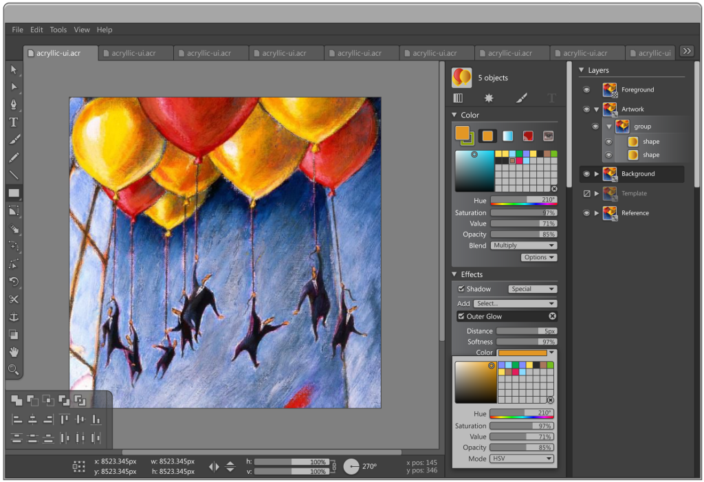
In writing this blog entry I guess in some ways I want to apologize personally to the press in particular! I do lots of briefings with the press throughout the year, either when we have news or when we have time at events/etc. to sit down and talk about the industry. For almost 18 months now I’ve had to spend a good 5 minutes explaining the names of these products, as they kept changing and we kept adding new products to the suite! If you take a look at Darryl K. Taft’s story on eWeek.com today you’ll get a sense of what a pain this has been for folks in the press (sorry Darryl and a gold medal for you for being able to keep it straight!!); just look at this paragraph: “The Microsoft Expression Studio consists of Expression Web (formerly known by the code name Quartz); Expression Blend, the new name for Microsoft Interactive Designer (formerly known by the code name Sparkle); Expression Design, the new name for Expression Graphic Designer (formerly known by the code name Acrylic); and a new tool, Expression Media.” Arggh! Ok, no more of that, ever again. Now we have our real names out there and we can move on to talking about the technology and the work of designers!
As a closing thought: when my wife and I travel on vacation we often discuss during the trip (at the aiport, on the flight, in the rental car) whether travelling is about the “journey” or the “destination”. On a trip, is it about getting lost on back country roads and stumbling upon the best restaurant of the trip on the way to Positano (Italy), or is it about being there on the beach taking a nap? Certainly the name of a product is usually entirely about the “destination”–as far as customers are concerned they only know about the gorgeous final product name (Xbox 360, Zune, Dynamics, Live, Windows, Visual Studio, Office… don’t forget, we actually have MANY good ones here at msft!). Certainly for those involved in naming a product, the journey is also a very important part of the experience… and I guess in the case of Microsoft Expression, you can thank us for sharing some of that “journey” with our customers, the good and the, shall we say, “confusing”.
Ahh, what a nice winter break. So nice in fact that I haven’t posted the following which I wrote while skiing in Whistler (gorgeous, recommend to anyone who hasn’t been. Great snow, nice people, and it’s oh-so close to seattle…)
What role does UI play in pro creative tools?
I first started with professional creative tools back in 1986 when I was using all the early era Mac graphics packages; Hypercard, Macromind’s VideoWorks, Pagemaker, and the first crop of digital photo tools such as Digital Darkroom. I pulled up a screen shot of VideoWorks just now, and it’s actually shocking how little things have changed — core elements of interactive design and animation are there, as they are today–transport controls, the stage, tools for direct drawing, timeline and keyframes, and the resource library full of “actors”. There have clearly been great improvements in the usability of creative pro tools, as well evolving aesthetics in terms of the “chrome” of the interfaces… but it has really been in the much more recent years that the really interesting innovation has come, and I believe that the next 5 years will be more radical still, with amazing evolutions and advancements in UI, driven by new platforms/tools for building UI, and more importantly by a new generation of designers and advancements in the craft.
When I arrived at msft to join the Expression team one of the first things that I took up as a personal ambition for the product was to *radically* rethink the way the product looked, not to mention the way it worked (usability and workflow). At Siggraph mid-year that first year (2004) I and many others were awed to see Apple’s new Motion product, which sported a radically new and different interface that departed from the traditional Final Cut Pro interface and Adobe After Effects look/feel/behavior. I and others were so bowled over by the look, that it was lost on us that the tool was actually very much a v1 and not quite ready for primetime… several of my friends in production confessed to me within weeks that “yeah, it looks pretty good, but you can’t actually do anything with it yet”. I think Apple repeated this mistake in an even bigger way with Aperture 1.0, which was so embarrassingly bad that I and other early adopters actually got a $200 store credit when they lowered the price just a few months later and rushed 1.5 to market—could there ever be a bigger mia-culpa for a 1.0 product? The lesson to me as a marketer was two-fold: the obvious = good looking innovative UI is something that can immediately set a product apart from a crowded and iterative set of knock-offs within traditional tool segments, and more importantly, you better back up that new UI with some pretty compelling and useful capabilities… because when you fall on chrome-sex appeal you fall *hard*. I’ve personally been very disappointed with several tools in this regard, initially with Softimage’s DS – equally amazing, if not the most amazing looking thing I’ve seen in a new 1.0 –, and more recently with Motion and Aperture—they all demoed great, but I put them away after a few hours of experimentation and haven’t gone back to them (I hear DS is now excellent, many versions later, and I’m sure Apple will keep at it and bring the motion graphics and digital photo tools to bare on Adobe’s position in those categories). Alias’ Maya, on the other hand, nailed it all in V1—great UI innovation, with a revolutionary product; wow, what a 1.0!. So, for Expression, specifically the Blend product (at the time code-named “sparkle”) the question was how to really pack in some gorgeous visuals and to have those drive the actual usability and customer success with the product. I’ll let our customers tell us how we did as far as the results—but I thought I’d share how we did it from a development perspective.
Building the UI of our UI design products
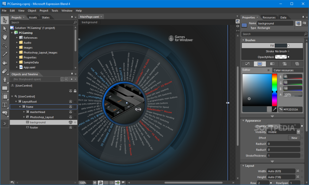
Alas, for the Blend team we had one incredible rocky and complicated development challenge that I don’t think many products have faced, certainly not to this degree. Expression Blend is a tool for designing WPF (Windows Presentation Foundation) based applications, which itself is built using WPF. In this regard, Blend is the most existential app that I know of.. each change to WPF platform required iterative changes to the app itself, from a UI and behavioral perspective, as well as to the functional capabilities. It would be as if Flash was actually built on the Flash player, or DVD Studio Pro was a DVD player based tool … it’s patently absurd to suggest such a thing of other tools, but in our case, they had to build using the tool/platform that was still being built. This led to incredibly difficult development challenges, where every week we had massive breaking changes and as the WPF project iterated through different templating, styling, animation, etc. models the entire Blend app would blow up and need massive re-working. Amidst this relative chaos, how could we really push the envelope on the interface of the tool itself? The answer was, we couldn’t! If you looked at Expression Blend in March of 2006, you saw a generic looking app with some massive usability problems. I dare say, I for one, thought it was a real stinker, and several former colleagues at Macromedia took great relish in pointing that out to me politely whenever I saw them. This wasn’t lost to anyone on the team—we just couldn’t pull back and focus on that area because there was literally too much going on at the platform level that had to be addressed first. Fast forward less than 6 months and look at the app we put out in Beta Dec 2006 (effectively only 3-4 months of actual development work, given the testing and locking down that occurred before Beta), it’s really amazing what transpired. Huge improvements to usability/utility, and a completely new look feel that goes beyond simple color palette changes, and includes new controls/modalities that we didn’t have at our disposal just weeks earlier. The reason this was possible was because of the nature of WPF—and speaks to the very core promise of the platform.
Unlike traditional applications where the way a control looks, behaves, and functions are inexorably intertwined in the code that makes up the control… with WPF these concepts are separated and therefore independently editable and just as importantly iterate-able. A team of “visual designers’ went to work on a series of mood studies and layouts for the interface, which a separate team of interactive designers ingested and applied the concepts to the interface using XAML. In traditional software UI development the next step would be for the designs to be handed off as Photoshop files or flattened PNGs, nay maybe even just a piece of paper!, and a team of developers would begin scratching their heads thinking of how to recreate those visuals using code and user drawn controls. Not in our case. Manuel Clement, the Blend product’s first designer, had this demo he would do internally to other msft teams that would absolutely bowl everyone over where he’d actually use an alpha version of the software to make changes to the interface controls that made up the app itself, then he’d check in his changes, rebuild, and voila—“Sparkle Eats Sparkle as he called it.. the ultimate existentialist demo, where a Blend was used to design Blend itself. It would be nice if we could have really built the entire UI that way—but the truth is that the rapid changes in the platform and the tools always kept the working solution just beyond our reach except for a few scenarios where we got lucky; for the majority of the work we used Expression Design to design the visuals and generate XAML code, but the actual implementation into our UI set required a lot more manual work than we would have liked. Still—we were using XAML code from end-to-end, and the inherent power of the WPF platform to fully customize the look/behavior without impacting the functionality. Samuel Wan, a wicked Flash designer/developer and the Program Manager that did much of the actual implementation of the UI designs created by Aaron Jasinksi (visual designer) was able to work with the XAML UI, using Blend features that were working and manually when not, to rapidly implement the designs. The speed with which the results took shape were amazing—with daily builds in august showing incredible advances each morning at 8:30 as I eagerly arrived to see what wonders the team had accomplished in the last 24 hours. It reminded me of my days at Industrial Light and Magic, where each morning I looked forward to “dailies” (viewings of the previous day’s work on the film shots we were cooking up)—“Blend UI Dailies” if you will. Feedback from beta customers has been very positive, particularly from our Windows Vista ISVs who had been using the product for over a year and were delighted to see their feedback incorporated into the new build(s).
The best part is that now that we have Expression Blend almost finished, we can increasingly use the tool itself as we design the rest of the product family’s UI and iterate on our next releases coming down the pipe. I’ve been on numerous projects in the past where the idea of changing anything remotely as complex as what we were able to do with Blend v1 would have been an entire product cycle unto itself… the fact that we were able to ship a solid 1.0 product, with tons of usability innovations and a significant breadth of functional capabilities, plus a innovative and modern look/feel… wow, it bodes very well for software design/development in the years ahead and is harbinger of the many exciting innovations that we will be seeing very soon from the ISV community building WPF apps for Windiows. As we bring “WPFE” to market this year we will aim to bring similar capabilities to the design-development process for rich web applications and beyond… a cornerstone of our vision for the Expression family of tools.
So what exactly goes into the thinking behind a creative suite of tools? While the “office” suite of products is a well understood concept, there is less of a track record in creating conglomerations of tools for designers that really make sense. Within many creative disciplines there is a tremendous focus on specific skillsets or mediums. As a video editor myself back in the mid nineties, I had a need for motion graphics and titling software, but not sound sweetening. Colleagues of mine who focus on “web design” may or may not have a need for a interactive tool like Flash, as they may focus on standards based site designs with PHP/ASP.NET and raw HTML/CSS on the client. For that matter, to be honest, as a Office user myself, I increasingly find myself just using Powerpoint and Outlook… Word and Excel are much more specialized than anything I need on a regular basis. When we were putting together our plans for Expression Studio, we had many conversations about whether we were building individual products to solve the specific needs of a web or Windows medium, or, a solution/suite that would really be the primary solution for a discipline of design that was much less focused on technology, and much more focused on craft (hmm, in speaking of it in such terms I think I’m glorifying our approach before I’ve explained our decision—oh well).
With Expression Blend and Web we have (effectively) two WYSIWIG tools (Web is a “standards” XHTML tool, Blend a “XAML designer”). In some ways these two pieces of the studio might thus stand on their own, as the desire to build a XAML interface vs. a XHTML site are today somewhat silo-ed entities. But if you look at some of the killer “Windows” and “Web” apps that are emerging, particularly in the last year, it is clear that the dividing line between a web/windows app is an increasingly meaningless distinction. The best Windows apps today incorporate the power of the network and “cloud”, while taking full advantage of the desktop hardware, local storage, connectivity to hardware devices, and a variety of presentation contexts (such as the living room, desktop, or notebook on the road) for optimal end user experience. Similarly, the best “Web” apps today increasingly offer richer, less-latent, more productive experiences—hereto not expected in a “browser”. Microsoft’s many platform investments, in web and media servers, client and server scripting, and SDKs/APIs for both Windows and ubiquitous browser based runtimes, likewise break down the traditional notion of web vs Windows.
For Expression Studio v1 we will deliver Blend, Web, Design, and Media—four products with varying degrees of direct integration. Design and Blend are particularly well integrated, sharing a common UI, and a coupled XAML workflow that really focuses on the staged process of taking “visual design” elements and applying them to interactive interface elements/controls/layout. Web sits a little astride for now, with a focus on XHTML and ASP.NET website development, while Media is a pure workflow play, offering a kick-ass asset management solution (note: I’ve been a fan of iView Media Pro, the product we acquired in June 2006 explicitly to bring into the Expression Studio; I first started using MediaPro back in 2000, and today have over 30,000 images/files in my catalogs that I keep track of using the tool). As the “WPF/E” technology comes to market, the natural need for XAML markup will extend across all of the products in the family, forming a common lingua franca for describing the look and behavior of everything from a Windows application control to a interactive video website that runs perfectly on a Mac OS browser such as Safari.
Our vision is that in the same sense that other creative tool suites have focused on Desktop Publishing and Photography, or Apple’s FCP as an all things video/media… the Expression Studio will be an integrated solution of tools for crafting the best User Experiences—whether those be for Windows, the Web, or beyond… This is very much a still emerging market segment, one that we expect will grow rapidly in the years ahead as the creative designers and developers in the space usher in a new era of rich, compelling experiences for computers, devices, and other “surfaces” (on walls and floors, among others!

