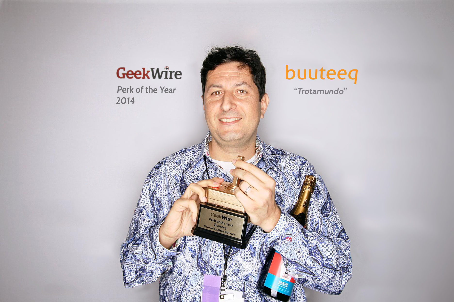
I’m incredibly proud and happy to have won the Geekwire Awards Perk of the Year 2014 for buuteeq’s employee travel stipend program, “Trotamundo”. I started buuteeq because of my deep passion for travel and seeing the world. We created the Trotamundo program because we wanted our company culture to embrace and amplify the experience of travel. Travel exposes us to diversity of human experience, inspires us, and ultimately transforms our world view in a way that also makes our company stronger and more nimble in our quest to revolutionize the hotel industry.
My company buuteeq has grown to over 110 employees in 5 offices around the world, so a huge component of my time/role as ceo has been focused on “culture”–how do we create a consistent best-practice culture in multiple offices (while growing rapidly), how do we gather feedback and input from everyone on the team, and how do we communicate and implement changes based on the feedback we receive…
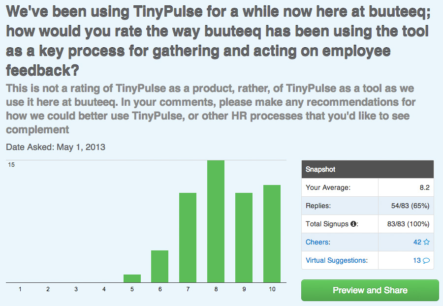
We’ve been using an amazing tool called TinyPulse for over a year now, and while it is not the only mechanism to manage the “pulse” of our culture (a lot of 1:1 coffees at TopPot Donuts down the street is part of my weekly routine to spend quality time focused on listening and responding to team member questions in person), TinyPulse is the systematic breadth process by which we receive regular employee feedback and drive a “virtuous cycle” that repeats itself regularly. TinyPulse asks a weekly question by email (automatically), gathers the feedback anonymously (usually between 50-80% of employees respond on any given week), and presents dashboards that I and our VP of Talent review periodically throughout the week as data is being gathered.
Each week’s question generates a summary of yes/no, 1-10 scale, or open response questions, AND a subjective detail commentary (if respondent provides) which I can then respond to via a private message while maintaining anonymity. This leads to very different feedback loops than what we hear in person or over email.
I thought it would be valuable, and transparent (one on my most cherished values!), to share some of the data we’ve gathered in the last 6 months. This data represents “feedback”, not judgement, so there is absolutely no shame in sharing what at times looks like mediocre scores/responses. I’ve written a brief summary of “what we took from the feedback” and “what we did to respond” to illustrate how the data drove our management team behavior.
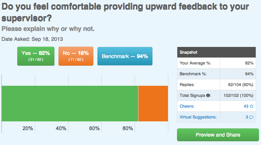
Takeaway: we can do better! Some of the atomic comments suggested some of the managers were sensitive to receiving constructive feedback; we had a discussion with all managers about best practices and how to engage in discussions that would surface constructive feedback from their team.
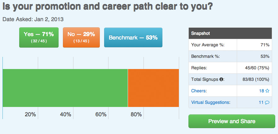
Takeaway:Totally unacceptably low! Even though the “benchmark” (53%) (what other companies that use TinyPulse received on average response) was even farther below our score (71%), we aspire to more transparency in this (and most) areas. As we dug through the data we realized we hadn’t developed “career stage models” and communicated those to team members. As a young company we had done a good job recruiting people to join the team but hadn’t yet matured into providing a roadmap for careers. This was really great feedback it led to a kick-off of many projects which we are now rolling out (took about 3 months to put in place).
Takeaway:The comments were valuable as they pointed to specific growth opportunities that were being recognized, and others that were being asked to be opportunities.
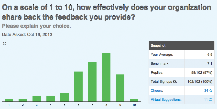
Takeaway: This question felt like a reflection on how well we were sharing the TinyPulse data itself! When we first started using TinyPulse we would share the feedback each week and discuss comments and then open for public discussion during our weekly friday wrap meeting (held 4-5pm to end the week). This made the visibility of the feedback 100% transparent. We gradually started to do the open discussions less frequently and moved the sharing of the data to our Google+ community and email threads, which i sense was less visible. There are 2 key elements to the feedback loop, (1) to share what is being said so everyone has visibility into how their feedback compares to that of the broader team, and (2) for everyone to see what is done in response to the feedback. This creates a “feedback tax” that I think would scare off a lot of management teams, but i really want to rise to the challenge, even as the data grows in volume and complexity. Blogging about the data here is in part motivated by this very feedback–trying to find multiple ways to drive the transparency!
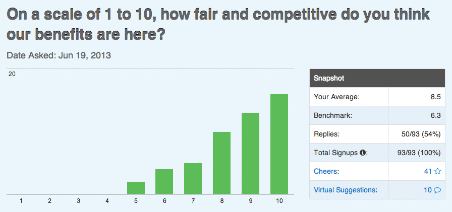
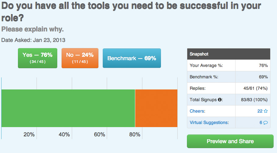
Takeaway: We’re doing pretty well, but there’s always room for improvement. We used the opportunity to revisit all of our benefits and our VP of HR gave examples of comparable benefits of companies in our industry/size/market, so really we “re-pitched” ourselves in hopes of getting more visibility to just how good our benefits actually are!
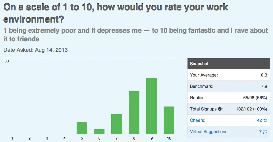
Takeaway: This is a perpetual rich channel of feedback, eg: the TinyPulse gathers lots of insights from the teams about office furniture, seating configurations, meals that we bring in for catered lunches, the kitchen/snacks, morale events, etc. etc. So rather than look at the score here, the really interesting takeaways are the comments that highlight what is top of mind “next on the list” of things to work on to make the office environment better.
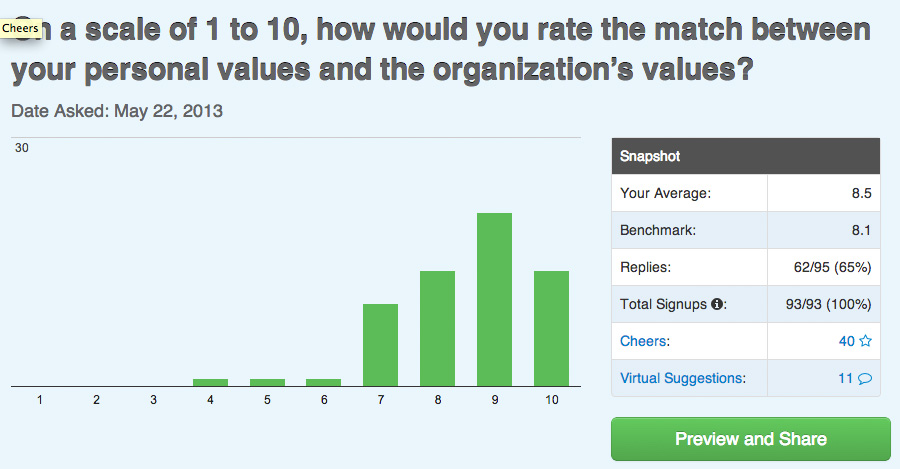
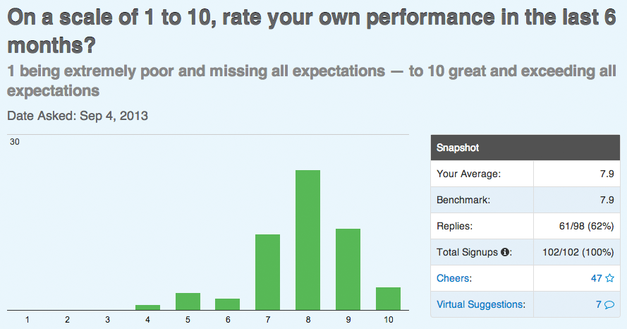
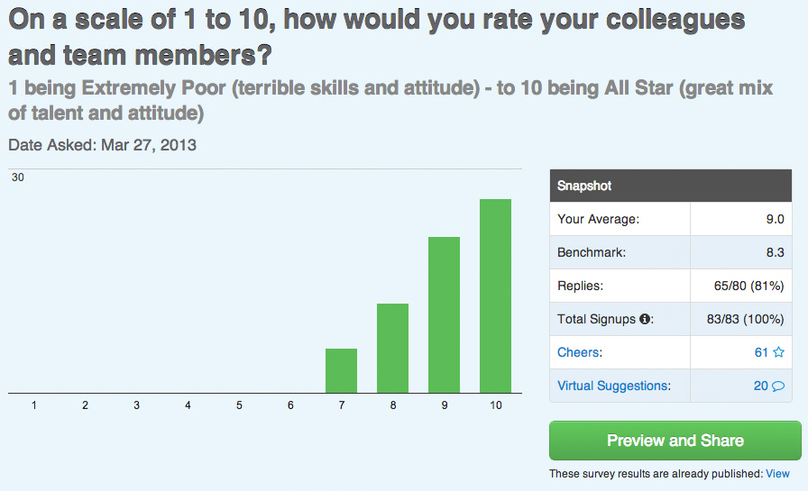
Takeaway: Sometimes you just have to declare victory. This is one of those. It turns out that on just about any “scale of 1-10” survey, the results tend to come in at an average of about 8.x. We talked with the team about the different perspectives of “what does a 8 mean”, and in many cases 8 is “excellent” and in others “10” is the equivalent. So when the team as a whole is coming in at 8.5, we felt that this is an area we were performing ahead of the curve. Again, not declaring victory outright, but since we are getting this type of feedback WEEKLY, sometimes the pulse feedback insights less urgency/reaction from the management team.
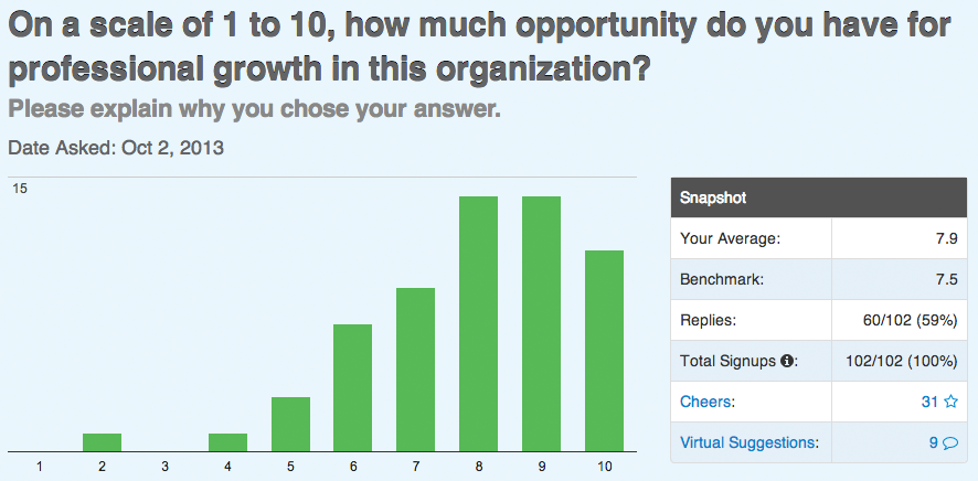
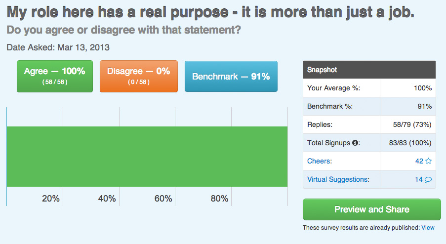
Takeaway: Great reflection of our core value of “never stop growing”, always want to see team members thinking of ways they can do better, and the comments overwhelming reflected specific areas for personal growth.
Takeaway: Similar to the feedback about work environment, this question had very specific recommendations for different processes, training, tools, etc.–super actionable.
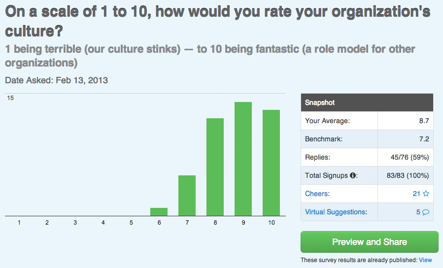
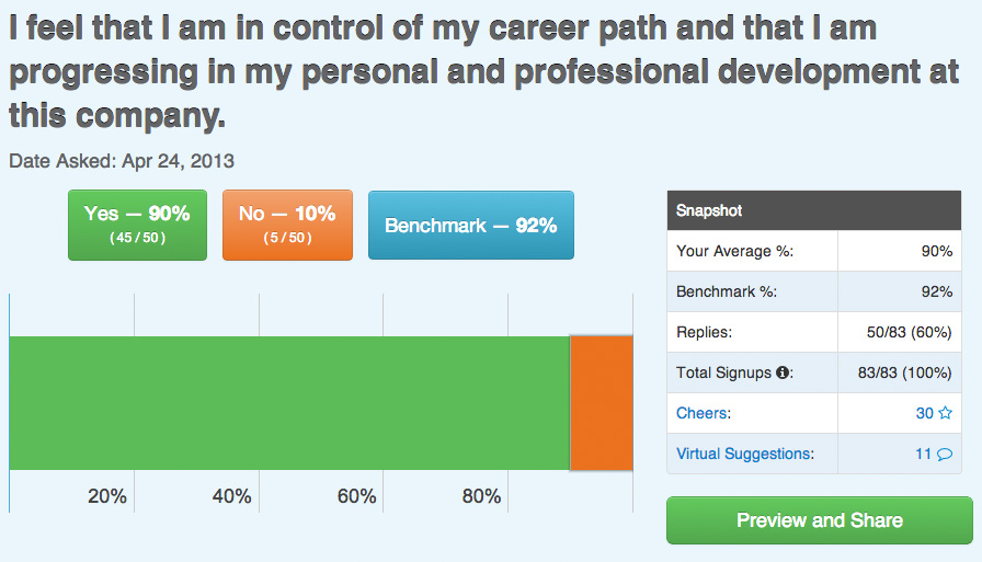
Takeaway: Probably the most important feedback of all–this is exactly the entire point of using TinyPulse, to drive transparency, virtuous feedback loop, and to establish a really great culture in close collaboration across the team. Thankfully, this score (8.7) is the highest score we’ve ever received in the tool. Lots more work to do on all these subjects every day of the week for years to come… Several more examples below, i’m out of gas to comment on them atomically, but the graphics speak for themselves and i’m happy to answer any questions in the comments or at my email, twitter, facebook, linkedin, or google + pages!
Adobe Flash® is a multimedia platform used to add animation, video, and interactivity to web pages. Flash gained popularity as a website development technology because it offered high-impact, rich Web capabilities at a time when there were no other alternatives (other contemporary web technology options lacked these capabilities). Today, Flash is a very poor choice of technology to power a hotel’s website—a question that many of buuteeq’s customers bring to our attention, so I’d like to outline the issues and clarify some of the design and development concerns, maintenance costs, and technical obstacles that are involved when using Flash for hotel marketing websites.
First some background: earlier in my professional career I worked at Macromedia (the creator of the Flash technology before it was acquired by Adobe Systems), and I was the Sr. Product Manager in charge of the Flash product. I personally oversaw the “media” aspects of the product line, which included the rich graphical, video, animation, and marketing features of Flash, and was responsible for business planning and taking the technology to market to make it successful with different audiences. One of the audiences that I and my peers focused on at that time was websites that wanted to deliver video, which turned out to be a very successful market for Flash (YouTube, Vimeo, and a vast number of important websites that deliver video online went on to use Flash—and it is generally accepted that without Flash, the explosion of video on the web in the 2004-2008 era would not have been possible).
Another market that we marketed Flash to at the time was hospitality. We built compelling demos and case studies and then went to the hospitality space to show hotels, airlines, and travel agents that by choosing Flash they could create a richer, more interactive, more clear presentation of the product and services they were offering, in an attempt to drive higher satisfaction scores and conversion ratios which would together yield better business results. For its era, Flash was indeed an interesting choice and we had a good story—but even then there were cataclysmic issues involved when using Flash for e-commerce sites, and Macromedia itself got a black eye when it tried and failed to switch its own website over to the technology (and within a week had to revert back to standard HTML).
The technical case against Flash was outlined very eloquently by Apple CEO Steve Jobs in his open letter to the tech community, which you can read here. I will thus speak more directly to disadvantages of Flash in the specific case of Hotel Websites, the key issues being:
SEO: Flash hinders Google organic search and produces lower SEO relevance
Mobile: Flash based hotel websites are not compatible with most mobile devices.
Cost: Flash is needlessly complex choice of technology to design, develop, and maintain your hotel’s website.
There are better looking and performing alternatives!
Let me elaborate (while staying conceptual so as to not get too deep into the technology):
Flash is Bad for Google search Discovery and SEO
Google, Bing, and other search engines send out crawlers that travel the internet, index websites by noting keywords, content and meta-data, then rank the websites based on the content they find. Being fully “discoverable” by these crawlers is a pre-requisite so that you can be found by guests when they do a Google search However, Flash based websites are seen by Google as big opaque “black boxes” that Google’s crawlers cannot directly examine.
The makers of Flash have tried to get around this by building a system whereby the developer of a website can attach a “tag” on each part of a Flash website that says to Google “hi Google crawler robot! Thanks for coming to look at this website, which you can’t see for yourself but let me be nice and tell you what it is: a great hotel website with pretty photos and cool room amenities. I know you can’t actually see that for yourself, but trust me, that’s what’s in here—so please believe me and send customers my way!” This is of course a non-starter for Google, because at the core of Google’s success is the concept of trust and relevancy. What if the Flash website in question is a pornography site, but the tags adorning the black box say “educational curriculum for physical health”. Google simply does not trust something it can’t see, and Flash websites are thus ignored.
Flash is not compatible with many mobile devices
Flash websites cannot be loaded on the vast majority of existing mobile phones or on important platforms that are setting the trend for the future such as the Apple iPhone and iPad. If a user attempts to view a Flash website on their phone they’ll be greeted with an empty screen. Various studies indicate that 30% of mobile users in the U.S. already regularly surf the web from their phones, and by 2014 the time spent on mobile internet browsing and mobile search queries is expected to overcome that of desktop in many parts of the world (in some, it already has!)
Furthermore–hotel websites built with Flash are actually also not compatible with about 10-20% of desktop PC users, because many PCs are running older versions of Flash that won’t load newer content, and most hotel research and shopping is done Monday through Friday during business hours, while people are sitting at their desk at work on computers that they do not have permission to install/upgrade or otherwise administer. Any business that is trying to market themselves and their brand to a breadth consumer audience simply cannot afford to invest in a website that isn’t reaching 100% of interested parties!
Cost
“With great power comes great responsibility” (or so says Peter Parker’s uncle in the movie Spiderman), and because Flash is indeed capable of many interesting visual effects and animations, Flash based website designs tend to include the design and development costs of using some of these rich features. Hotels might initially be pleased with the look of their Flash website but once they realize the prohibitive costs associated with maintaining a Flash site, the site often gets neglected. When a hotel’s site becomes neglected, its functionality diminishes and consequently, the utility of the site diminishes for guests, and business suffers. The cost of building a hotel website in Flash needs to be measured in the lifecycle of the site over many years, not just in a one-time design and update.
The internet has evolved immensely and today there are other technologies available that offer a “rich” Web experience. Broadband is now pervasive, computers are faster, web standards increasingly support “visual effects” and animations that were once unique to Flash. These alternatives not only look great but they are far cheaper to develop and maintain.
For all these reasons, Flash is a poor choice for hotels aiming to offer a rich and compelling experience to as many guests as possible.
The alternative: great looking, better performing hotel websites using the latest web standards (HTML5)
The websites produced by buuteeq’s system are built with industry standard technologies that ensure a positive and satisfying user experience and conform to SEO best practices. buuteeq websites share the rich look and feel of Flash but outperform Flash in the following ways:
buuteeq websites are SEO and Google friendly. As opposed to Flash, buuteeq powered websites can be properly crawled and indexed by Google. buuteeq sites have a much better chance for a higher ranking in Google compared with Flash-only sites.
buuteeq websites are fully compatible with all mobile devices. buuteeq websites are designed to load properly on all mobile devices. This includes smartphones such as the iPhone and Google Android phones and tablet computers such as the iPad. buuteeq websites are specially designed to look great and work great across all the various digital channels that consumers use to research travel decisions. This ensures that hotels are reaching the widest possible audience of guests; something Flash cannot offer.
buuteeq websites are much more affordable than flash-based sites. All costs associated with managing and maintaining a buuteeq website is far cheaper than that of custom developed Flash sites. All the added costs of compensating for Flash deficiencies can be applied to more meaningful projects with a buuteeq powered solution.
buuteeq Launch Jan 2011
After 18 months of planning and hard work, i’m really proud of the launch of buuteeq today. buuteeq has been my baby; a concept that i put together myself with great support and inspiration from my wife and our multi-trip-travel experiences while living in Asia for 2 years and taking family vacations. I’m beyond proud of the product we have shipped, and the marketing collateral, positioning, demos, pricing, segmentation, etc. are the best i’ve ever been responsible for–a really nice progression in my professional experience. I feel like everything i’ve done in the last 20 years professionally was leading me to this moment: to the skills, the perspective, and the creativity that was necessary to pull this off.
http://www.buuteeq.com for the website experience. Embedding the “welcome” video here in case someone stumbles on this blogroll.
Robert Scoble Interview of Forest Key, ceo of buuteeq, Jan 2011
I drove out to Robert Scoble’s house to show him buuteeq; i was exhausted from a long day of travel, but robert’s abode was a warm and welcoming environment, and his infectious upbeat mood and passion for all things wonderful and innovative that relate to technology made me really enjoy showing him buuteeq. After seeing the footage i am more jealous than ever about not having my own Canon 5D with a fast lens–it is amazing how good the image quality is in his videos, and incredible that he is shooting so much of it and producing it as quickly as he does. We joked that someone should build him a dedicated SaaS platform for post processing and posting his content–but his workflow is very unique as is the individual. Thanks Robert for the opportunity!
Why Flash is a bad choice for Hotel Websites
Feb 1, 2011
One of my inspirations for starting buuteeq was all the crappy flash microsites for boutique hotels. We put together a little video to help highlight the key issues that make flash a really bad choice for hotel websites.
Why Bad Hotel Websites are Bad
A fascinating new survey from eDigitalResearch reviewed the usability of 51 UK websites and came up with some interesting results. The top rated UK hospitality website was Booking.com, which looks like this:
The worst ranked site was Ryanair.com, which looks like this:
What can we say about these two? Are they similar? Kinda. They both have all the same parts (search, reservations, reviews, ads, news, etc.) but they also look drastically different. One is pleasing; the other is confusing. Why? It all boils down to what we call Information Architecture (IA).
IA can be summed up as “What users expect to find and where they expect to find it”. Internet browsers browse the Internet in similar and specific ways. That is, many of them look in the same place to find the same information. If you design a website with good IA, then your users will find what they want when they look for it, and they will have a good browsing experience. A good browsing experience equals higher sales. If your site has poor IA it produces a poor browsing experience, resulting in poorer sales.
This is why Ryanair.com performed so poorly compared to Booking.com. It has conflicting colors that strain the eyes, and the site is a jumble of links and tabs, buttons and ads. This is poor IA.
How does this apply to hoteliers? True, both sites mentioned above are not individual hotel websites, but hotels were also studied in the analysis and performed dismally. As tnooz.com summed it up:
“Among other findings from the survey, hotels as a group was the poorest performing sector. Their websites often lacked such basics as FAQs and their email customer service performed subpar.”
Just like all other websites, hotel websites must have good IA in order to perform well for their guests. This is where buuteeq comes in. We have spent years of research to understand how IA works on the web and the best way to implement it in a hotel website. What we produce is digital marketing for the web, mobile phones and social sites that has eye-catching color branding and great IA, giving guests what they want, where they expect to find it. An hotelier could spend $10,000 on a rich flash site that has lots of moving images and sparkly effects, but if a guest can’t find the reservation button, what good is it? Form is nice but function is essential. buuteeq marries them.
eDigitalresearch.com offered some best practices for hotel industry websites. The ones that specifically pertain to hotel websites are:
“First impressions: ‘Homepage needs to convey clear offer and encourage further search.’ The homepages of the low-scoring websites were ‘overwhelming and confusing.’”
“Email customer services: The contact method has to be easy and responses should be “prompt and professional.” For low-scoring websites, contact information was difficult to find and there was a lack of response to emails.”
“Telephone customer services: Consumers shouldn’t have to wait forever on the phone, and agents should be able to answer specific questions. Long wait times and difficulty in finding phone numbers characterized low-scoring websites.”
“Booking process: Websites should arm consumers with the ability to change their options before completing the booking and the process shouldn’t require human intervention on the part of the company. Low-scoring websites had booking processes that weren’t intuitive and often couldn’t be completed online.”